A customer has asked me: “How can I include an experimental point on a figure generated in FactSage ?”. The procedure is relatively simple. Suppose that you have generated a curve in FactSage like the one below.
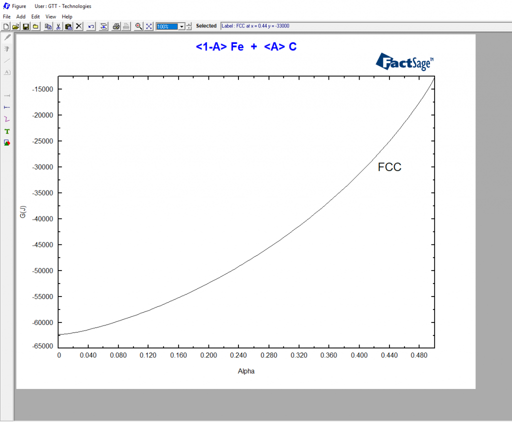
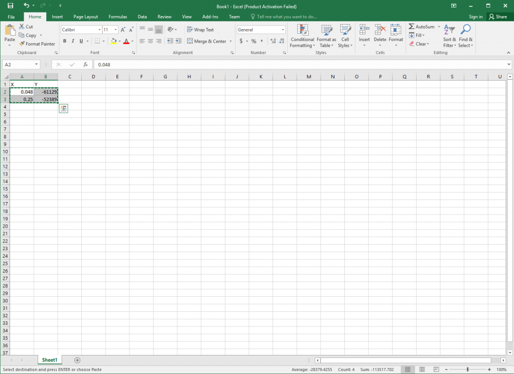
Representing the Molar Gibbs Energy of the γ phase in the Fe-C system at 1000°C as a function of its carbon composition, expressed as a molar fraction. If you want to add two extra points to the diagram, you can start by typing in their coordinates e.g. in Excel. Then you simply mark the cell block like in the picture below and copy it with Ctrl-C.
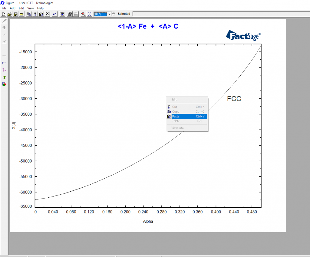
To paste the points into the diagram, you must come back to FactSage. When you are back to FactSage, with the mouse arrow on the diagram, you press the right mouse key for the selection menu depicted below to appear.
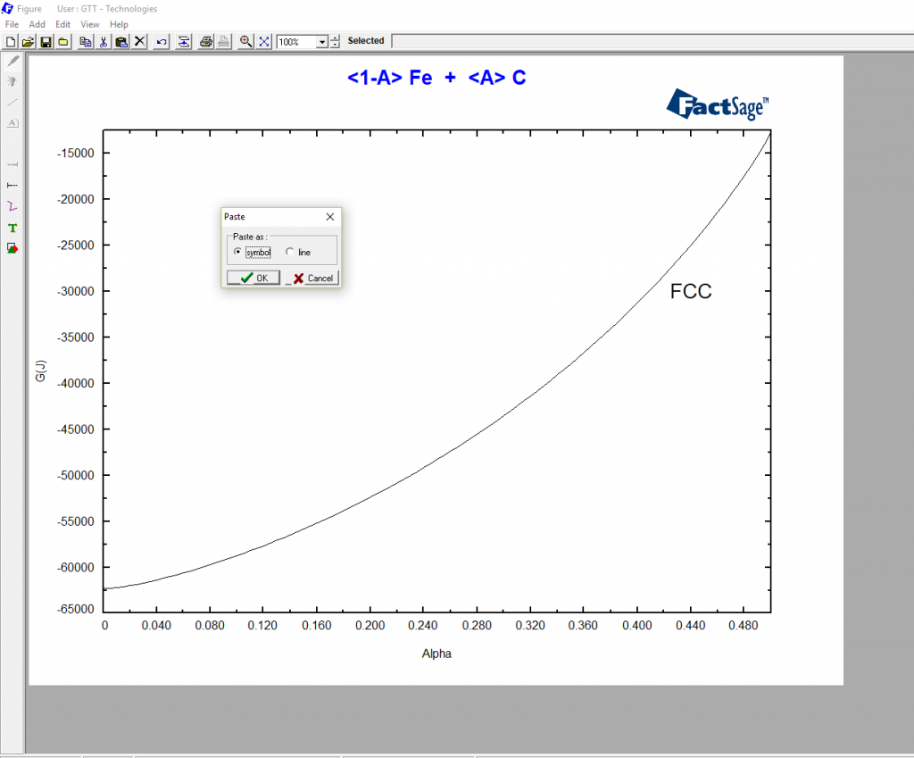
Then you left click “Paste” in the selection menu and when the window “Paste” shown below appears, you click on “OK”.
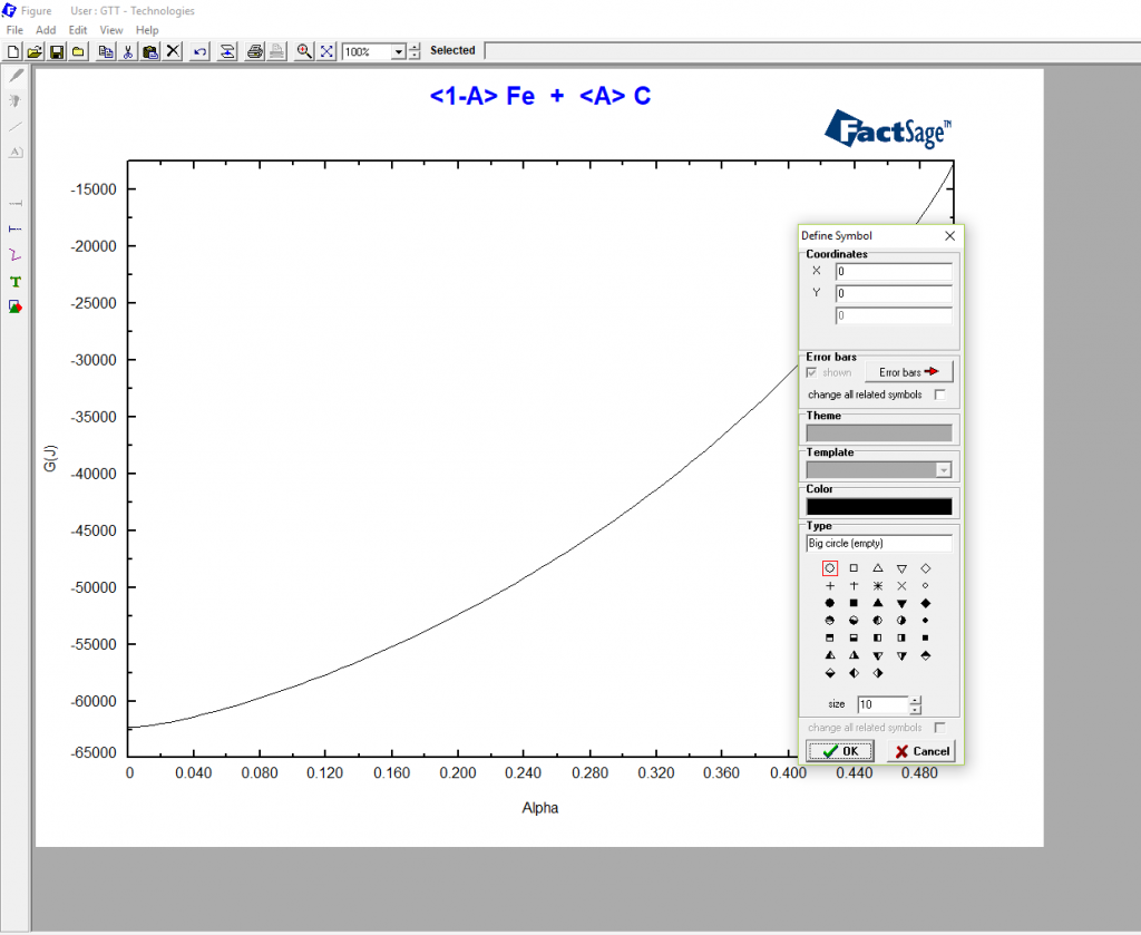
Finally, when the “Define Symbol” like shown below appears, you choose the kind of symbol you would like to use and its size and click on “OK”
And that’s it!
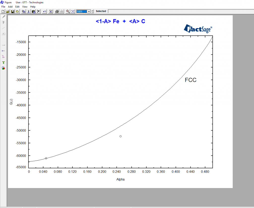
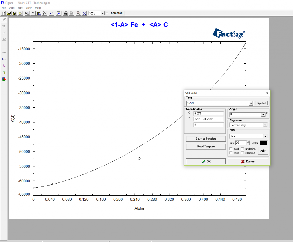
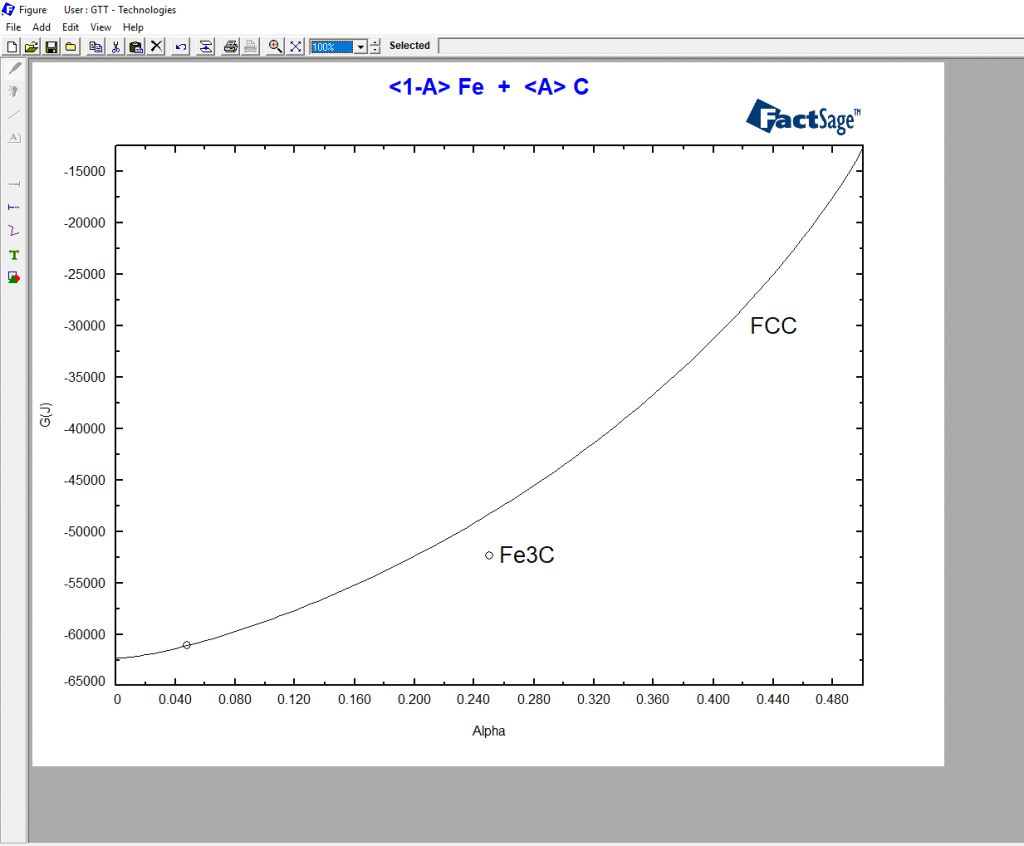
If you now wish to label a point, you short click with the mouse next to the point and then you click on the green „T“ on the left side bar. A menu appears for you to type the label text in.
Moreover, I use this feature for plotting iso-lines in ternary diagrams : )
Thank you for your comment Bora Derin!
Could you please send me the example codes for reduction kinetics study using macro processing.